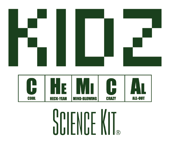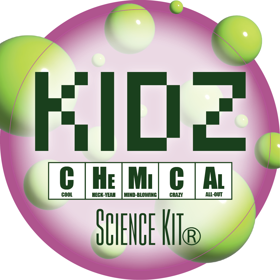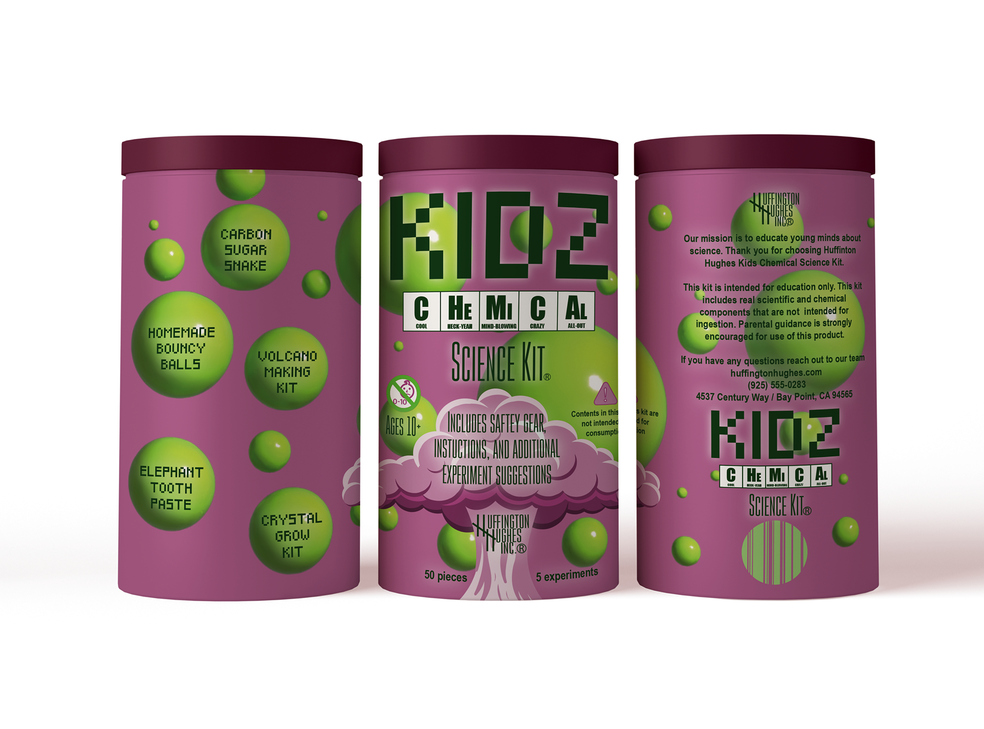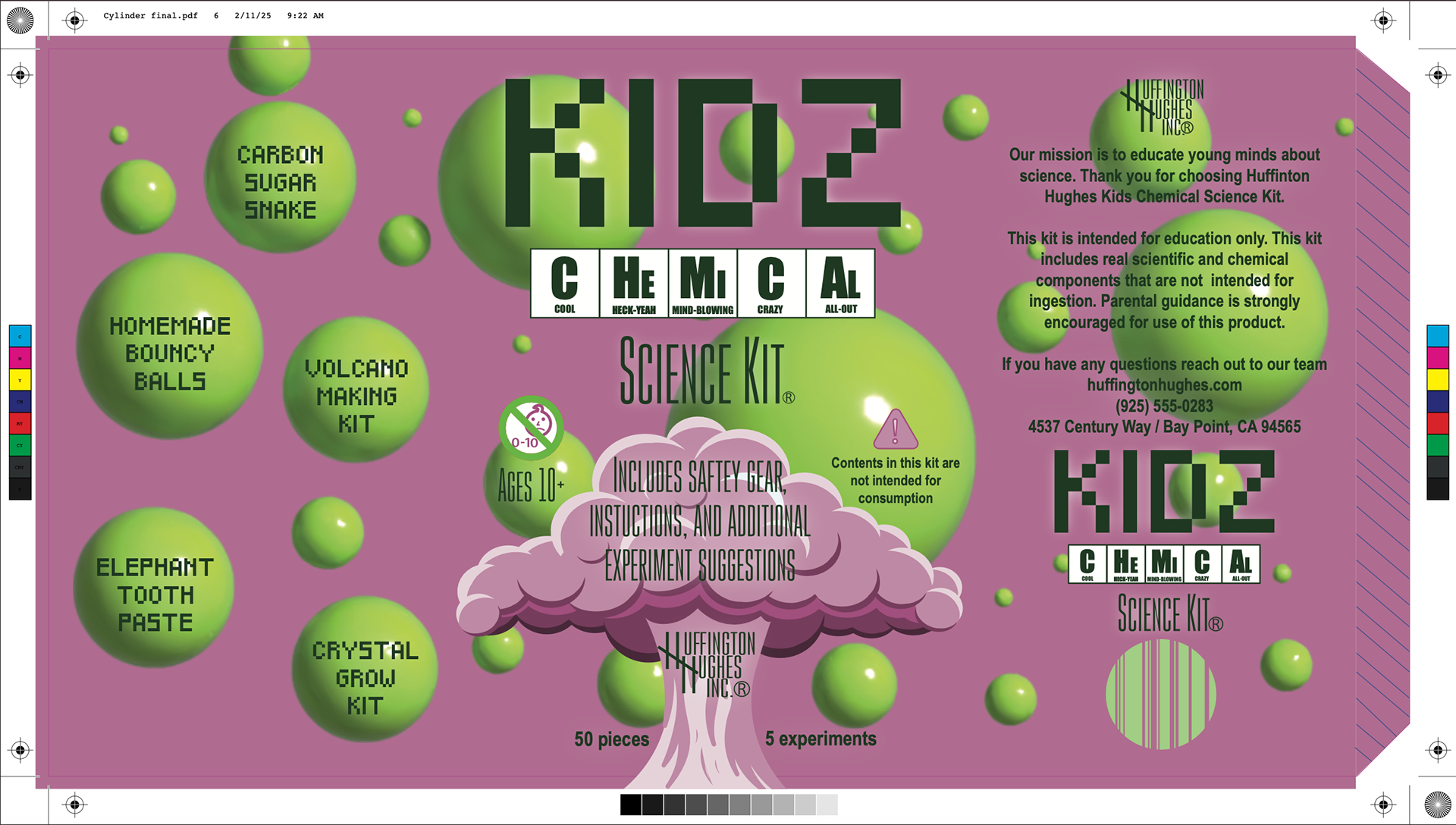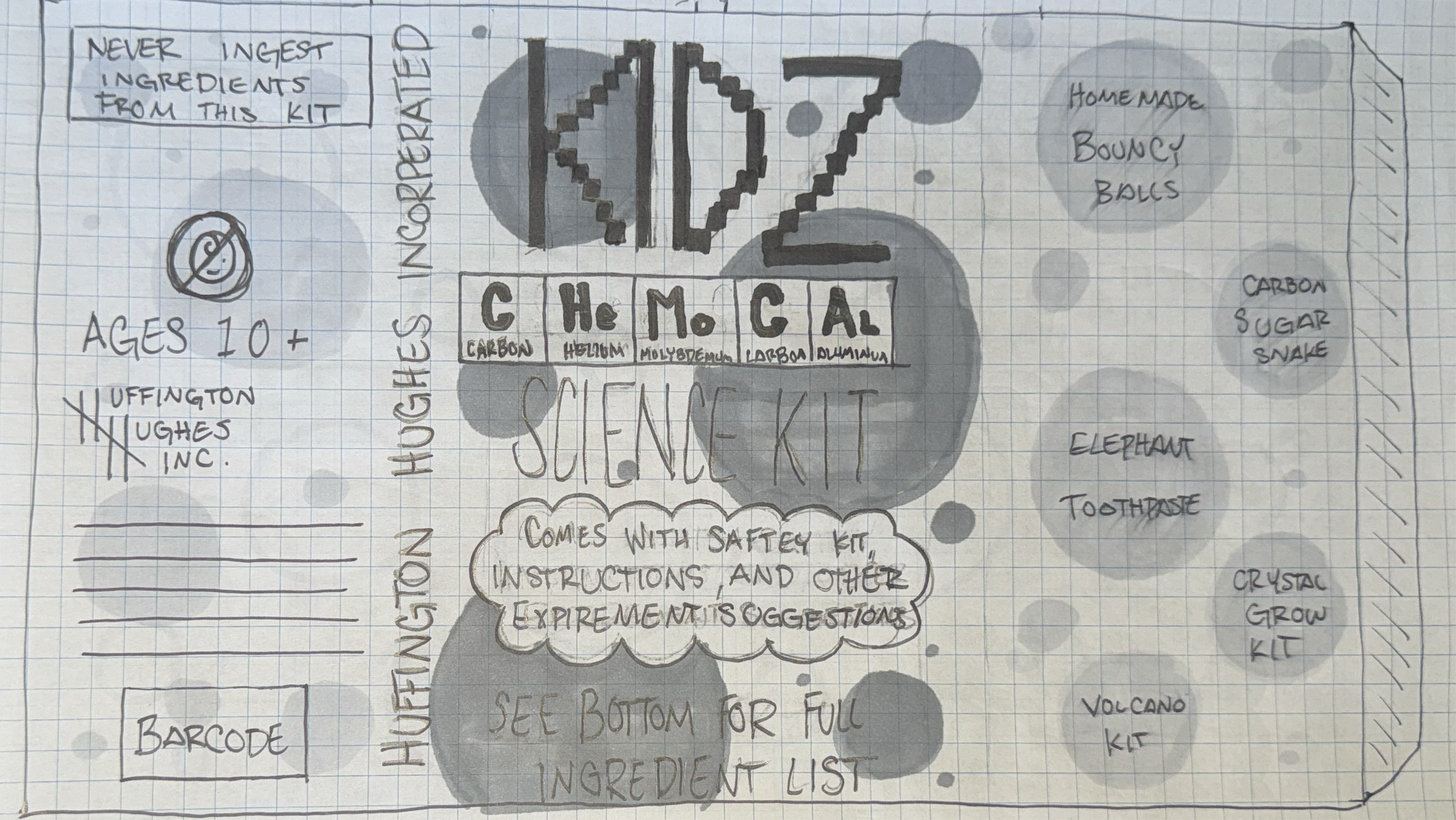
The Kids Chemical Science Kit brand needed scientific seeming elements to make the brand and packaging stand out. With that in mind I chose to use a green throughout my design to bring to life that science feel for the design. The bright colors should draw a child’s attention and the color combination is fitting for both boys and girls which gives the toys a much broader reach. I had originally planned to use blue in the color scheme but after trying out multiple color combinations with the design the maroon worked best for both readability and versatility.